Print75
Numbered by pillar, then position: 4b is the second piece on pillar 4.
- 1a
Alan E. Muraoka
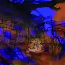
A Year of Living Dangerously: Jakarta Slum
Jakarta, Indonesia, 1965: A nation on the verge of violent revolution.
Read more
Against this turbulent backdrop, three vivid characters get swept up in a strange and consequential love triangle: Guy Hamilton, a reporter freshly-arrived from Sydney with a taste for danger, a ton of ambition, and a nose for news. Jill Bryant, an intensely bright, attractive attaché at the British Embassy, wary of relationships and fiercely independent. Billy Kwan, a diminutive Australian-Chinese photojournalist with a passionate need to remake the world in the image of his ideals. As the political tension builds to a boil, the lives of these three characters become increasingly intertwined, leading to an explosive ending rife with tragedy, danger and romance.
A Year of Living Dangerously is a daring new musical with an immersive experience. The audience will be, upon entering the “theater”, transported to Jakarta, Indonesia, 1965. The audience will “live” the experience as the cast takes us on a journey that is exciting, emotional and nail biting.
The concept:
The venue for the show is a raw space (warehouse/open concept forum) in which the audience will be seated in the center of the space, on pallets that are mobile. The action of the musical takes place throughout the space. The pallets are cast manipulated, so that the audience focus can be changed as needed, to the location of the action.
Imagine Pedi cabs/Betjaks throughout the house, a bustling city full of strife, the smell of rain and soil and you are in the middle of it all. You have entered Jakarta, Indonesia, 1965. Upon entering, Gamelan music is heard with the visuals of large shadow puppets intermixed with stills of 1965 Jakarta projected on the walls. Cast members are in the “city” with you as you are escorted to your seat. Earth lines the floor and there is the feeling of being in a nation on the verge of a violent revolution.
As you are seated, you notice a large platform in front of you along with a large columnar monument with a golden flame. To your left, there is a mobile elevated playing space to represent the environment of the Priok wharf. Directly behind you is the British Embassy, more upscale in nature with all the sensibilities of a well-protected Embassy in a war-torn country. To the right is another mobile playing space, which would represent various locations in our story. The mobile playing spaces will start as a single unit and break apart to create these locations.
Portions of the ceiling and walls will be used as a space for projections, to create visual interest. This will allow for the display of the monsoon and other weather elements.
To recreate the street scenes and the riots within the city, the action will take place in the “aisles”. This will give the audience the sense of truly being part of the story, as it will be happening all around them and, in a sense, to them.
We believe that by making A Year of Living Dangerously fully immersive, the audience will walk away with a complete experience as opposed to just being entertained. The audience will have a true sense of what it was like to live within this time period in Jakarta and to experience this incredible revolution. By being fully immersed in anything, one garners a greater understanding of the subject matter and is more heavily impacted by it in one’s own life. Creating this kind of “real” experience will indeed take the audience on a journey they will never forget.
As an added bonus: During Intermission, Indonesian style food and drink can be purchased outside of the space from food trucks. This will help with the social media aspect of promotion for the show, as well as supporting local business owners.
- 1b
Alan E. Muraoka
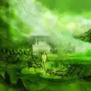
A Year of Living Dangerously: Bogor Resort
Jakarta, Indonesia, 1965: A nation on the verge of violent revolution.
Read more
Against this turbulent backdrop, three vivid characters get swept up in a strange and consequential love triangle: Guy Hamilton, a reporter freshly-arrived from Sydney with a taste for danger, a ton of ambition, and a nose for news. Jill Bryant, an intensely bright, attractive attaché at the British Embassy, wary of relationships and fiercely independent. Billy Kwan, a diminutive Australian-Chinese photojournalist with a passionate need to remake the world in the image of his ideals. As the political tension builds to a boil, the lives of these three characters become increasingly intertwined, leading to an explosive ending rife with tragedy, danger and romance.
A Year of Living Dangerously is a daring new musical with an immersive experience. The audience will be, upon entering the “theater”, transported to Jakarta, Indonesia, 1965. The audience will “live” the experience as the cast takes us on a journey that is exciting, emotional and nail biting.
The concept:
The venue for the show is a raw space (warehouse/open concept forum) in which the audience will be seated in the center of the space, on pallets that are mobile. The action of the musical takes place throughout the space. The pallets are cast manipulated, so that the audience focus can be changed as needed, to the location of the action.
Imagine Pedi cabs/Betjaks throughout the house, a bustling city full of strife, the smell of rain and soil and you are in the middle of it all. You have entered Jakarta, Indonesia, 1965. Upon entering, Gamelan music is heard with the visuals of large shadow puppets intermixed with stills of 1965 Jakarta projected on the walls. Cast members are in the “city” with you as you are escorted to your seat. Earth lines the floor and there is the feeling of being in a nation on the verge of a violent revolution.
As you are seated, you notice a large platform in front of you along with a large columnar monument with a golden flame. To your left, there is a mobile elevated playing space to represent the environment of the Priok wharf. Directly behind you is the British Embassy, more upscale in nature with all the sensibilities of a well-protected Embassy in a war-torn country. To the right is another mobile playing space, which would represent various locations in our story. The mobile playing spaces will start as a single unit and break apart to create these locations.
Portions of the ceiling and walls will be used as a space for projections, to create visual interest. This will allow for the display of the monsoon and other weather elements.
To recreate the street scenes and the riots within the city, the action will take place in the “aisles”. This will give the audience the sense of truly being part of the story, as it will be happening all around them and, in a sense, to them.
We believe that by making A Year of Living Dangerously fully immersive, the audience will walk away with a complete experience as opposed to just being entertained. The audience will have a true sense of what it was like to live within this time period in Jakarta and to experience this incredible revolution. By being fully immersed in anything, one garners a greater understanding of the subject matter and is more heavily impacted by it in one’s own life. Creating this kind of “real” experience will indeed take the audience on a journey they will never forget.
As an added bonus: During Intermission, Indonesian style food and drink can be purchased outside of the space from food trucks. This will help with the social media aspect of promotion for the show, as well as supporting local business owners.
- 1c
Alan E. Muraoka
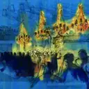
A Year of Living Dangerously: Hotel Ballroom
Jakarta, Indonesia, 1965: A nation on the verge of violent revolution.
Read more
Against this turbulent backdrop, three vivid characters get swept up in a strange and consequential love triangle: Guy Hamilton, a reporter freshly-arrived from Sydney with a taste for danger, a ton of ambition, and a nose for news. Jill Bryant, an intensely bright, attractive attaché at the British Embassy, wary of relationships and fiercely independent. Billy Kwan, a diminutive Australian-Chinese photojournalist with a passionate need to remake the world in the image of his ideals. As the political tension builds to a boil, the lives of these three characters become increasingly intertwined, leading to an explosive ending rife with tragedy, danger and romance.
A Year of Living Dangerously is a daring new musical with an immersive experience. The audience will be, upon entering the “theater”, transported to Jakarta, Indonesia, 1965. The audience will “live” the experience as the cast takes us on a journey that is exciting, emotional and nail biting.
The concept:
The venue for the show is a raw space (warehouse/open concept forum) in which the audience will be seated in the center of the space, on pallets that are mobile. The action of the musical takes place throughout the space. The pallets are cast manipulated, so that the audience focus can be changed as needed, to the location of the action.
Imagine Pedi cabs/Betjaks throughout the house, a bustling city full of strife, the smell of rain and soil and you are in the middle of it all. You have entered Jakarta, Indonesia, 1965. Upon entering, Gamelan music is heard with the visuals of large shadow puppets intermixed with stills of 1965 Jakarta projected on the walls. Cast members are in the “city” with you as you are escorted to your seat. Earth lines the floor and there is the feeling of being in a nation on the verge of a violent revolution.
As you are seated, you notice a large platform in front of you along with a large columnar monument with a golden flame. To your left, there is a mobile elevated playing space to represent the environment of the Priok wharf. Directly behind you is the British Embassy, more upscale in nature with all the sensibilities of a well-protected Embassy in a war-torn country. To the right is another mobile playing space, which would represent various locations in our story. The mobile playing spaces will start as a single unit and break apart to create these locations.
Portions of the ceiling and walls will be used as a space for projections, to create visual interest. This will allow for the display of the monsoon and other weather elements.
To recreate the street scenes and the riots within the city, the action will take place in the “aisles”. This will give the audience the sense of truly being part of the story, as it will be happening all around them and, in a sense, to them.
We believe that by making A Year of Living Dangerously fully immersive, the audience will walk away with a complete experience as opposed to just being entertained. The audience will have a true sense of what it was like to live within this time period in Jakarta and to experience this incredible revolution. By being fully immersed in anything, one garners a greater understanding of the subject matter and is more heavily impacted by it in one’s own life. Creating this kind of “real” experience will indeed take the audience on a journey they will never forget.
As an added bonus: During Intermission, Indonesian style food and drink can be purchased outside of the space from food trucks. This will help with the social media aspect of promotion for the show, as well as supporting local business owners.
- 2a
Katie Kangas
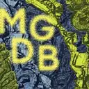
MGDB
This work was designed while branding a graphic design biennial that focused on celebrating the creative abilities of the Midwest. This option explored experimental design practices that reflected our relationships to the land.
- 2b
Samraddhi Shrotriya
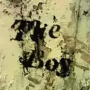
The Boy
This piece began as an obsession with what letterforms look like when they deteriorate.
Read more
The typography was distressed by hand, built into concrete and time, and designed to feel like something that had always existed on a crumbling wall somewhere. It was made with care and then set aside when another direction took over. It never found a home. It never found an audience. Until now.
- 2c
Michaile Brooks
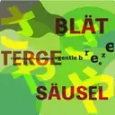
Farbe Sprache: Onomatopoeia
Language is the reflection of ourselves.
Read more
While the linguistic roots might be different, we are connected more than we know through their similarities. I've always loved the concept of Japanese onomatopoeia, which represent sounds that humans, animals, and nature make in addition to feelings or states of being. I was interested in whether or not onomatopoeia exists in other languages as well, and happily discovered during my studies that in German, it’s known as “die Onomatopoesie.” It's also referred to as “die Klangnachahmung,” which means sound imitation, or “die Lautmalerei,” which can be translated to the idea of being loud or with sounds.
This piece is part of my series "Farbe Sprache: Onomatopoeia," my way of using Japanese, German, and English in a playful way to show and strengthen those connections visually with typography.
- 3a
David G. Stone
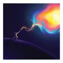
Story Hunters | Close Encounter
Story Hunters was to be an animated documentary short film introducing audiences to a ragtag crew of survivalists in a post-climate apocalyptic future who believe a single story has the power to change the world.
Read more
Told through four distinctly unique visual styles that represent each of our narrators and the harsh world they find themselves living in, we follow this team on a mission to uncover the one story that will inspire humanity to hope again and to remind the world that no matter how dire the situation may be that nature finds a way to survive and humanity still has a chance to course-correct and fix the damage done by generations that came before.
This frame shows an artist's impression of discovering a new story for the very first time. This art style, featuring a range of abstract minimalism, gradients, geometric shapes and occasional patterns, was designed to represent the inner mind of an artist who grew to find themselves in time through a journey to overcome insecurity and social anxiety.
Equal parts climate advocacy and creative experiment, this project began as a sales pitch for MOWE Studio and quickly grew into a passion piece that would challenge our team to explore new techniques while showing off the wide range of the studio's potential. As can happen with internal projects our ambition grew larger than our scope, and over more than two years of development the studio's priorities changed, funding shifted, and we made the difficult decision to put the project to rest before beginning animation.
Nearly all creative development on the project was completed at the time of shutdown, with a locked script, storyboards, animatic and one style frame completed.
Credits Creative Director + Writer: David G. Stone; Executive Creative Director: Raff Marques; Storyboard Artist: Max Vera; Styleframes & Concept Design: Natália Brondani, Victor Rosa; Producer: Ruby Valls; Executive Producer: Felippe Silveira; Animation Director: Pedro de Britto; Sound Design: You Too Can Woo; Production Company: MOWE Studio
- 3b
David G. Stone
Story Hunters | Style Frames
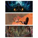
The second in a set of two Story Hunters pieces, these frames show the full range of art styles Creative Director David G. Stone and MOWE Studio explored for a short animated documentary film that was never completed.
Read more
Equal parts climate advocacy and creative experiment, the project would have invited viewers to imagine four different takes on the world: from the wildly abstract depths of the human psyche (as featured in the first piece in this series) to the thickly brushed nostalgia of memories warped by time to the harsh linework and chromatic minimalism of a post-apocalyptic reality to the efficiency-driven paper-cutouts of a left-brained pragmatist.
Shown in this piece are:
• A memory of a duel witnessed between a vampire and a vampire hunter
• An interview setup with the leader of the story hunting crew
• A diorama of teenage life in an oppressive world after humanity migrates underground
With storyboards, characters and initial concept frames all designed, voiceovers recorded and animatics edited, our team made the difficult decision to end this internal passion project before starting animation.
Credits Creative Director + Writer: David G. Stone; Executive Creative Director: Raff Marques; Storyboard Artist: Max Vera; Styleframes & Concept Design: Natália Brondani, Victor Rosa; Producer: Ruby Valls; Executive Producer: Felippe Silveira; Animation Director: Pedro de Britto; Sound Design: You Too Can Woo; Production Company: MOWE Studio
- 3c
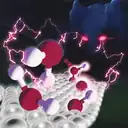
Laura Gonima
The WhereWulff - Scientific Journal Cover
This was a rejected academic journal cover submission made with Blender and Photoshop that proved too silly for the journal's taste. We ultimately reworked the same assets to be less imaginative and made the cover of a subsequent publication.
Credits Jay Bender, Ph.D. - Scientific consultant and collaborator
- 4a
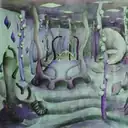
Gosia Goralczyk
Cuttlefish by Witkacy
The Cuttlefish, or the Hyrcanian Worldview, is a 1-act surrealist play written in 1922 by the avant-garde writer and painter Witkacy.
Read more
The main character, Paul Rockoffer, is a depressed artist whose non-realistic paintings were burned by the totalitarian government. My interpretation of the play operates totally in the artist's brain. He "lives" there and sees the whole world rushing through his head: his "cuttlefish" fiancée Ella, her mother, his muse Alice D'Or, himself, and a few other characters engage in bizarre debates about art, absolute power, and conformity. The set is made of soft elements (like brain) that gently bend under the actors' movements. The costumes are built as organic forms. That was a student project designed for a film environment, exploring imagination and creativity, waiting to be brought to life in Hollywood!
- 4b

Yusuf Gencer
Hidden Knowledge Mail: Memory Stamps
Originally developed as a proposal for a biennial exhibition, Hidden Knowledge Mail: Memory Stamps explores birth and collective life through the visual language of postage stamps.
Read more
The project was not selected, and its planned installation remained unrealized. This image preserves a fragment of an unfinished project—a small trace of an idea that never reached its intended form.
- 4c
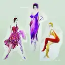
Gosia Goralczyk
Cuttlefish by Witkacy - Part 2 - Characters
The Cuttlefish, or the Hyrcanian Worldview, is a 1-act surrealist play written in 1922 by the avant-garde writer and painter Witkacy.
Read more
The main character, Paul Rockoffer, is a depressed artist whose non-realistic paintings were burned by the totalitarian government. My interpretation of the play operates totally in the artist's brain. He "lives" there and sees the whole world rushing through his head: his "cuttlefish" fiancée Ella, her mother, his muse Alice D'Or, himself, and a few other characters engage in bizarre debates regarding art, absolute power, and conformity. The set is made of soft elements (like brain) that gently bend under the actors' movements. The costumes are built as organic forms. That was a student project designed for a film environment, exploring imagination and creativity, waiting to be brought to life in Hollywood!
- 5a
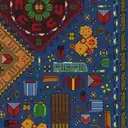
Rezvan Rashidi
Fragments of a Lost Paradise
For nomadic Qashqai weavers, a rug is more than a decorative object, it is a portable world.
Read more
Rooted in an ancient Persian idea of paradise as a carefully ordered garden, these woven landscapes translate memory, environment, and belief into pattern and color. As nomadic communities moved across vast terrains, the rug became a way to carry a sense of place with them. Motifs of plants, animals, and geometric fields echo the structure of Persian gardens, spaces designed to bring harmony and balance to the earth. Within each knot lies a fragment of landscape and a trace of lived experience. This project extends that idea into the present. Just as nomadic weavers embedded their lives and landscapes into rugs, many immigrants today carry fragments of their identity through the personal objects they bring with them, photographs, tools, clothing, small souvenirs, or everyday items.These objects act as contemporary symbols of memory and belonging. This project explores the rug as both artifact and metaphor: a woven surface where culture, movement, and the human desire for paradise converge.
- 5b
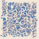
Talia White
Gridded Ridge
The artwork is an abstract version of a topographic map, which uses geometric figures to portray the nature of land and mountain ranges.
Read more
The artwork includes organic forms that are in blue to represent the landform while elevation and boundaries are highlighted in red. This way gives a three-dimensional view that encourages people to explore and interpret the artwork for themselves. It's a continuation of my previous work that stresses the importance of exploration and experimentation. The concept that is inspired by the terrain is because of its effect on travel and lifestyle.
- 5c
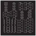
Steven Ryan
Lattice Tessellate
This is one in a series of Java-based explorations in organic spatial constructions utilizing simplistic tessellate dissolves. The custom app that was developed ports the controls out to an Intech Studio EN16 controller that was used for manual parameter refinements.
- 6a
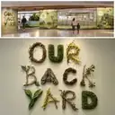
Lila Marty
Habitat Playspace
Our Backyard is a children’s playspace designed to celebrate and explore the local flora, fauna and landscape.
Read more
The space brings elements of different terrains into the experience, creating opportunities for children to play, discover, and learn about the natural environment around them. Through hands-on experiences, the playspace encourages curiosity while teaching children how we can respect, care for, and help preserve the habitats we share.
- 6b
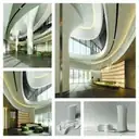
Oleg Kardaev
Sculpted by Light
Sculpted by Light is a lobby design concept that carries the building’s flowing geometry into its interior through sculptural columns, sweeping curves, and continuous lines of light.
Read more
Natural stone, greenery, and a suspended lighting installation create a calm, welcoming space conceived as a seamless extension of the architecture.
- 6c
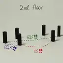
Iana Evseeva
Second Floor: Spatial Study
An early analog study exploring the arrangement of square columns on the second floor of a building through physical models, walking distances, and movement paths. The direction was abandoned when the project shifted from a spatial interpretation toward a flatter graphic system for the final poster.
- 7a
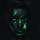
Ian Vicknair
Infectious Expression
This ongoing project is to portray society from my experience living overseas.
Read more
Many of us have blank sullen faces. With these expressions viewed, I wonder what people's true colors are hidden beneath the darkness. This project is to help unveil those emotions, those different expressions that individuals hide in plain sight.
- 7b
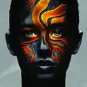
Ian Vicknair
Resilience
This ongoing project is to portray society from my experience living overseas.
Read more
Many of us have blank sullen faces. With these expressions viewed, I wonder what people's true colors are hidden beneath the darkness. This project is to help unveil those emotions, those different expressions that individuals hide in plain sight.
- 7c
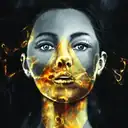
Ian Vicknair
W O R D S I N E V E R S A I D
As artists we are bound to communicate through visual design.
Read more
We applied the same idea to a real-life situation with women's rights. Through history, women have challenged society and pushed the boundaries of their abilities and a big part was through verbal communication.
We wanted to show this through our design. She is quiet, speechless and unwilling to talk. The gold diamond over her throat and neck shows how powerful a voice can be. The effects of smoke and air coming out of her mouth represents her voice leaving waiting to be heard.
- 8a
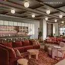
Brooke Kalvaitis
Fulton Market Lounge
Amenity bar & lounge within an office building in Fulton Market
- 8b
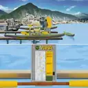
Charles
YAKA
What if bikes weren't the only transport we shared communally? Introducing YAKA, a self-service "tide" sharing system.
- 8c
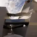
Nate O
CRACKED MUSEUM
This was an idea from 2021 where the building was cracked to create an alleyway that would be covered in graffiti.
Read more
It needs to be rendered with graffiti, and the building overall needs to be brought to a higher level of detail.
The project was used to explore Rhino plugins and rendering softwares; it was not completed because I procrastinated until I forgot about it completely.
- 9a
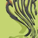
Meredith Anderson
Zyrox Experiment
I did this experiment to create visual assets for the 45th edition of Crook & Folly, DePaul University's Literary Arts Magazine.
Read more
Moving images on a flatbed scanner creates this warped effect and is a technique often used in making zines. Although I didn't post or publish this experiment, it strengthened my ability to incorporate analog techniques into my digital designs.
- 9b
Ryan M. Odom
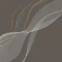
3D Data Streams
Data interpolated with a 3D vector. Client chose a more traditional approach.
- 9c
Khadija Aziz
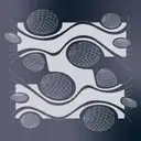
Astral
Originally created as a Physics/Space-themed graphic, these forms have been re-organized to create the letter "I".
Credits @studio.joons
- 10a
Nahid Yahyaee
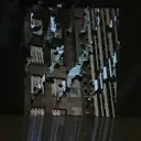
Remainder City
The work sits between the city we build and the material we throw away to build it.
Read more
It begins with what stayed behind: the perforated, fractured sheets that held the shape of something taken away. This piece is part of an experimental project in projection mapping. My photographs of Chicago's streets and architecture are projected onto laser-cut architectural waste, the offcuts left over from architecture students' models.
- 10b
Katie Osborne
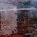
24 Memories
Right before I moved to Chicago in 2019, I took a trip to New Orleans to photograph my favorite spots on film.
Read more
The reel never fully locked in, thus never advanced frames, so my trip resulted in 1 film photo with 24 of my favorite memories. It was slightly heartbreaking, but the textures from this photo inspired me to experiment with (intentional) overlay photography.
- 10c
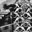
Amesyah Flowers
ZON Branding Identity
A failed identity rebranding, with little time and a lot of ambition, but also with a lot of doubt and imposter syndrome.
Read more
An interpretation of a Korean Electric bike brand that emphasizes values of athleticism, focus, and willpower. Inspired by the passion of the F1 identity branding. A file that no longer exists to edit but floats in limbo for others to come across.
- 11a
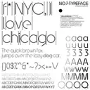
Sajad Amini Studio
No.7 Typeface
A neo-geometric typeface designed for brutalist objects.
Read more
Designed in four weights. Finished in approximately zero. The project remains unfinished due to a lack of time, unnecessary commitments, overthinking, and life being life. Hopefully, it’ll be finished one day.
Credits Sajad Amini
- 11b
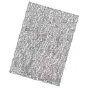
Steven Ryan
In Stitches
This is a single frame from a custom Java algorithm I wrote for a generative art experiment.
Read more
This resulting collection explored the idea of connecting typographic tiles that are randomly rotated, scaled and compressed into constrained spaces. For this particular test I was trying to assess how the frames aligned with each other so I added the diagonal stroke as a visual test.
- 11c
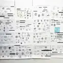
Kate Parks
Dead Marks
These are preliminary identity studies for a furniture brand rooted in craft, real materials, and the idea that well-made objects become part of the lives built around them.
Read more
Before moving into digital design, I work through dozens of thumbnail sketches to push past the obvious — testing expected ideas, strange ones, and small variations until something worth pursuing begins to emerge. Most of these marks never left the page, but the process ultimately helped lead to a finished identity that did make its way into the world.
Here, the client name has been given a slightly classified treatment, leaving behind a field of dead marks: the searching, repetition, and discarded possibilities that usually disappear once a brand is resolved.
Credits Parks Personas LLC - Kate Parks
- 12a
Jen James
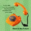
Take Me Back to The Future: Rotary Phone
Take Me Back to the Future is an ode to simpler times, when technology was clunkier, communication was slower, and somehow it all felt a little more personal.
Read more
The series looks back at the things we used every day—from mixtapes and rotary phones to AIM away messages and T9 texting—and the little experiences that came along with them. Bright colors, halftone textures, warped patterns, and imperfect imagery give each piece a nostalgic, slightly worn-in feel. It’s not necessarily about wanting the technology back. It’s about missing how life felt when we used it.
Credits Jen James Design, LLC
- 12b
Jen James
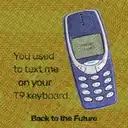
Take Me Back to The Future: T9 Phone
Take Me Back to the Future is an ode to simpler times, when technology was clunkier, communication was slower, and somehow it all felt a little more personal.
Read more
The series looks back at the things we used every day—from mixtapes and rotary phones to AIM away messages and T9 texting—and the little experiences that came along with them. Bright colors, halftone textures, warped patterns, and imperfect imagery give each piece a nostalgic, slightly worn-in feel. It’s not necessarily about wanting the technology back. It’s about missing how life felt when we used it.
Credits Jen James Design, LLC
- 12c
Jen James
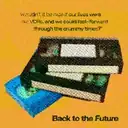
Take Me Back to The Future: VHS Tapes
Take Me Back to the Future is an ode to simpler times, when technology was clunkier, communication was slower, and somehow it all felt a little more personal.
Read more
The series looks back at the things we used every day—from mixtapes and rotary phones to AIM away messages and T9 texting—and the little experiences that came along with them. Bright colors, halftone textures, warped patterns, and imperfect imagery give each piece a nostalgic, slightly worn-in feel. It’s not necessarily about wanting the technology back. It’s about missing how life felt when we used it.
Credits Jen James Design, LLC
- 13a
Caleb Fisher
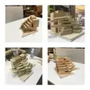
Office In Burbank
This is a massing model for a developer-driven office building.
Read more
The project brief called for open floor plans with ample rooftop terraces at every floor. While this scheme had merit and met the brief, it was ditched for another with double curved facades and much less outdoor space. The developers backed out. Meanwhile, another partner in our office praised this scheme for its potential. Two alternate realities haunt me now: one where the scheme made it to the client's desk, and another where I worked under a partner who appreciated my design sensibility.
- 13b
Graham Jefferson
Magenta Mull-Overs
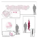
Environmental design / art concepts for a law client that were intended to abstractly represent themes of community, and fusion/joinery. The project scope changed early in the design development phase, and many environmental design locations were removed from scope.
- 13c
Charles
Lily
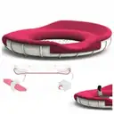
Seating System
- 14a
Roland Montijo
Ad Astra
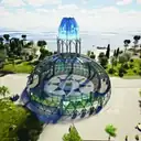
This dome was created to be seen in a mural from the supine position of the sleeper in the room that can be seen in the center of the 3D model dome.
Read more
The sky, constellations, stars and planets are seen for the birth month of the client in the mural. The idea further developed beyond the ceiling mural and simple dome into a museum about the project, with the dome being placed on an island. The dome also became structurally a double dome with buttressing and geodesic glass work, the client's bedroom placement was retained in its original location to the inner dome. 3d props modeled by me to paint from were later placed into this imagined museum. On the top of the bedroom one can see the mural I painted on canvas, along with the props now displayed in a row outside the bedroom model.
- 14b
Roland Montijo
Ad Astra Dome Museum Interior View
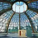
Interior of the dome museum with the client's bedroom positioned and props used for painting the ceiling mural on display.
- 14c
Roland Montijo
Bath and Greenhouse Retreat
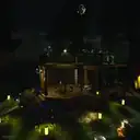
This work began as a design for a client's back yard island that was surrounded by a moat of water.
Read more
I envisioned a Bath and Greenhouse structure open to the environment, the moat being used as a lap pool round about in the summer and an ice skating go round in the winter, the balcony used for sunning and telescope viewing. The interior frontal room contains a large stone mosaic inlaid bath jacuzzi with a rainfall
ceiling. The glass doors allow views into the greenhouse and bathing area. The design attempts to blend into the landscape with homage to antique and modern masters.
- 15a
Aishwarya Shivakumar
A Second Skin
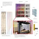
As part of the adaptive reuse of the Century Building at 202 S State Street, this proposal reimagines the facade of the adjacent building as a contemporary counterpart to the Century's ornamented white facade.
Read more
Iridescent glazing paired with vertical brass fins sets a dynamic surface beside a fixed, carved one. The fins pick up the vertical rhythm of the historic bays, while the glass and warm metal establish a dynamic contrast. The system is carried on its own structure, so the Century Building's historic fabric is left untouched.
- 15b
Corinn Hanson
Billy Sugars
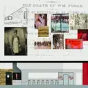
Billy Sugars is the brainchild of a partnership between a blood and guts loving husband and wife (who also have an affinity for really good BBQ), and Nicholas & Associates, a design-build firm in the Chicago suburbs.
Read more
The concept for the two-story southern comfort kitchen and late night lounge is based on William the Butcher, and his (imaginary) mistress. Designed to be just weird enough to give patrons that feeling of being out of their element, the experience is not for the faint of heart.
The first floor dining area featured here is Billy’s (William) turf. Meat hangs from a display case near the entrance. A fire pit for roasting pigs is the centerpiece of the kitchen, drawing attention to the smell of charred meat. The experience is completed with custom-designed lighting hanging from meat hooks over the bar, a raw concrete floor stained red like blood and animal bones adorning the walls. Billy’s mistress reveals her secrets to those bold enough to venture upstairs. The cocktail lounge, dimly lit with Victorian charm and seductive decor, doubles as a classroom with flexible furniture and a projection screen that drops from the ceiling.
Credits BOX Studios Chicago
- 15c
Zewei Liu (Carol)
THE FLOWING ARCHIVE
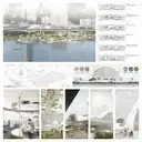
Situated along Melbourne's Yarra River, The Flowing Archive reimagines a neglected waterfront as a public landscape of knowledge, nature, and collective memory.
Read more
Inspired by the river's movement and the cultural history of Birrarung, the project transforms a traditional library into a continuous spatial experience, connecting reading, gathering, and storytelling through flowing architectural forms. Though never built, the project preserves a vision of architecture as a living archive — where landscape, culture, and everyday life converge. Not every story needs to be built to be remembered.
Credits Yuanhao Shen,Zewei Liu(Carol),Muxuan Zhao
- 16a
Jena Marble
Up in the Air
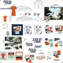
This project began as an idea for a potential t-shirt design, inspired by photographs of the Champaign County Fair in The Urbana Free Library Digital Collections.
Read more
Having grown up in Champaign County, moved away, and eventually returned, I wanted to capture the joy of a fair ride, the sugar rush of a lemonade shake-up, and the thrill of cheering for the home team. I soon discovered that it was an impossible task; I could never make all of those feelings hold still. The project was never finished, but the nostalgia behind it remains.
- 16b
Sharon and Guy
The Space Between
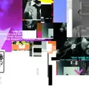
Originally conceived to resurrect an independent music magazine, multiple spreads from it are collaged together as a reconstruction of ideas, images, and remnants that reflect both the original vision and its eventual dissolution, becoming an artifact of what was envisioned, what was abandoned, and what continues to emerge from its remnants, and occupying the space between intention and failure, archive and invention.
- 16c
Ezekiel Ambrose Cambey
Fragments.
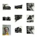
This is a collage of small broken fragments of ceramic with carvings, and one painting on paper. The images are taken from the torn pages of my sketchbook.
- 17a
Iana Evseeva
12 Spoons
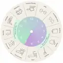
An early board game concept translating Spoon Theory into a twelve-hour daily cycle.
Read more
Players were given a limited number of “spoons” to spend across everyday activities while navigating the board. This visual and gameplay system was later abandoned as the project evolved into a more tactile, participatory game with a revised structure and visual language.
- 17b
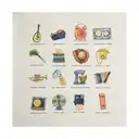
Lila Marty
A Recipe for Weird
A playful series pairing food with unexpected objects, with the intent of bringing them to life as large-scale sculptures.
Read more
The avocado guitar and lemon record player actually made it from wild ideas to fabricated pieces, while the rest of the combinations now live in our little graveyard of ideas. A reminder that we could all use a little more silliness in our days.
- 17c
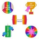
Maeve Spears
Stickers for The Ray
While working as a graphic designer for DePaul University, I was asked to design stickers for their Ray Meyer Fitness and Recreation Center (known as "The Ray").
Read more
Located in Lincoln Park, The Ray is used by alum and locals alike. The stickers were meant to foster community and highlight the gym's offerings. Given other design priorities, the stickers never came to fruition.
- 18a

Tanner Woodford
Radiant Chicago
Radiant Chicago was an early iteration of the Design Museum of Chicago’s membership coin, a small thank you for the museum's community.
Read more
The star and the colors come from the Chicago flag, and radiate just like the museum and the city of Chicago. This version ended up on the cutting room floor.
- 18b
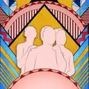
Jeffrey Hitchens
Funk Inspired Creativity
No description
Credits J. Hitchens Design / Jeffrey Hitchens
- 18c

Shrey Shah
Rising Sun
A vector illustration commissioned for a JDM automotive brand campaign.
Read more
The concept placed a 90s sports car against a rising sun, drawing on the visual language of Japanese car culture. The client cancelled before it went anywhere. The car was ready. The road was not.
- 19a
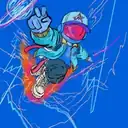
Rich Guzman
ASTROMAN — Streetwear Beyond Earth
Astroman began as a concept exploring the intersection of streetwear, sneaker culture, and science fiction. While the initial character and visual direction were established, I struggled to define how the concept could evolve into a larger story and cohesive creative world.
Credits 294Design
- 19b
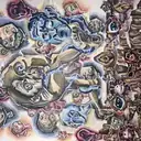
Jemsy Pradun
Big Brother
Based on the book 1984 by George Orwell
- 19c
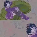
Ziggy Aurora Stardust
Sweet Devil: Mettaton EX
I originally wanted to blend the visual language of the music video for Sweet Devil by Hachioji P with Mettaton's (Undertale) natural sassy nature!
Read more
I got bored in class one day and decided to blend the two! This is actually one of the biggest pieces I've started to date! Unfortunately, I was diagnosed with FND my senior year meaning I was in and out of the hospital. I was too tired to roll over and work on him so unfortunately he fell by the wayside! I hate people seeing my unfinished work so hopefully putting him in this exhibit finally gives me the boost I need to finish him!
Credits Stardust
- 20a

Charles
4th
No description
- 20b
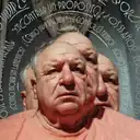
Madeleine Ortega
VIDA an Existential Magazine
Ever felt like you're running out of time?
Read more
Like you're a fat dog on a treadmill running as fast as you can but you can never seem to get the bone? "VIDA" is an Existential Spanish magazine that teaches its readers how to live good lives when they're wondering if anything actually matters. The devil in the back represents the looming dark presence that hangs over us all, to remind us of our short lives. The multiple figures of the man represents the disassociation of ourselves from reality when we question our being. The words circling around him say "How do we live with peace, not anger," "How do you die without regret," "How to live a happy life with little time," etc. The bottom of the magazine records its volume number by hours, minutes, and seconds -- representing the everflowing passage of time while we wait to live our lives.
- 20c
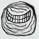
Melida Patricia Avila
Design #3
In the third year at the University of Illinois Chicago, during the Fall semester, this drawing was for the class assignment Newspaper-10 symbols, where I created 10 drawings of specific phobias I know and common ones.
Read more
This illustration, "fear of the cosmic," was meant to be part of it, but was cut because it did not have any semblance of a space/cosmic concept in this drawing; thus, it was changed.
- 21a
Melida Patricia Avila
Design #2
This was my class assignment at the University of Illinois Chicago in my third year in the program in the Fall semester. While the format remained the same in the final cut, what was lost was the color I picked out from the beginning before changing it to match the poster calendar.
- 21b
Emily Preece
We the People
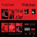
Inspired by the theme We the People, this visual system reinterprets the Preamble to the U.S. Constitution through the language of the digital age.
Read more
At a time when technology increasingly mediates our experiences, the work explores the tension between the pixelated and the tangible, asking what it means to remain human, gather in person, and share ideas.
Developed for a live ideas forum centered on the exchange of perspectives, pixels become a flexible framework for framing imagery, revealing information, and transitioning from digital abstraction to recognizable, full-resolution images. As the system unfolds, its underlying structure gradually reveals itself, creating continuity across varied compositions without ever presenting the full phrase at once.
We the People exists not as a single statement, but as a quiet, persistent system: a reminder that collective identity is built through individual voices, experiences, and perspectives that come together to form something greater than the sum of their parts.
- 21c
Aaron Sutherland
Urban Origins
This piece was intended to be a stylistic mosaic of different landmarks, founders, historic figures, and iconography all relevant to Chicago and its culture.
Read more
I decided to utilize the visual style of Brutalism for a few reasons. The main reason was due to me wanting to encapsulate a grungy urban like feeling with this piece’s overall aesthetic while also being bold and visually striking. The colors I chose reflect this boldness due to them being the colors of the Chicago flag but darker. I wanted to set this all on a background of the city’s street grid to help instill the urban neighborhood esque theme.
- 22a
Zach Bagnoli
Radio Waste
Wanted to create a London Calling-style poster but never finished it.
- 22b

Donald Koide
Stars
No description
- 22c
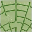
Hong Lee Loo
Resilience
An alternative iteration to a poster representing the value of resilience.
Read more
The original work was inspired by a quote from Faisal Khosa, which states that "Resilience is an admirable human capacity and a poor institutional strategy." It led to personal reflections about the expectations of exhibiting resilience when pursuing a creative career, especially during a time where it seems like the world does not want to make space for it. Why do we focus more on the outlets that help overcome our struggles rather than questioning the systems that placed us in such circumstances in the first place? These thoughts are placed on the page through representations of resilience: the bamboo, the web, and the spider that always repairs its damages.
- 23a
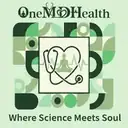
Bilal Syed
Brand Identity & Logo Concept for OneMD Health
This rejected brand identity concept was developed for OneMDHealth, a holistic health optimization brand centered around the philosophy "Where Science Meets Soul".
Read more
While the client ultimately chose a different direction, this proposal represents an ambitious attempt to physically weave clinical precision with mindful human wellness.
The identity is anchored by three symbolic typographic elements:
The Meditating 'O': The initial letter features a meditating silhouette to ground the brand in mindfulness and individual patient journeys.
The Heartfelt 'MD': A clinical stethoscope seamlessly curves to form a heart shape, symbolizing that true medical expertise requires sincere human care.
The Vital 'Health': Integrates an EKG heartbeat line to represent health as a dynamic, measurable state.
Presented as a comprehensive brand system—complete with a custom EKG-inspired pattern, a dual-green palette (Jay Green #0b4834 and Light Sage #61be82), and application mockups ranging from corporate stationery to supplement packaging—this project explores how complex, integrated health concepts can find harmony within custom typography (Argent GT and Source Sans Pro).
Credits Bilal Syed (Syed Designs Studios)
- 23b

Buddy Boor
Celebration of Nature
This illustration was meant to be the centerpiece of nature-themed branding system.
Read more
The idea was that different flora & fauna could be swapped or pulled out as accent pieces. Ultimately a simpler and more flexible design direction was chosen. This was the right decision but we still love these little guys.
Credits Other Things
- 23c
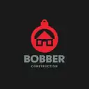
Carson Krause
Bobber Construction
This was a logo intended for a construction company in Minnesota.
Read more
The client wanted a bobber that also conveys the idea that they construct homes. I felt the best solution was to put the house icon at the boundary of where the red and the white on the bobber would normally be. The pointed tip of the house is used to subconsciously communicate the idea that a house goes up, much like a bobber goes out of the water. The client simply could not conceptualize this, so they chose a more literal logo by another artist on my team.
- 24a
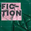
Meredith Anderson
Breaking the Digital Fourth Wall II
While designing the 45th edition of Crook & Folly, DePaul University's Literary Arts Magazine, I created an archive of design assets for the book cover and interior category pages.
Read more
One of my early iterations for the book's design incorporated digital 'watermarks' such as selection boxes and text highlights. These elements often go unnoticed by users of design software, so including pieces of the interface became a way to break the digital fourth wall. While I pivoted away from this concept for the final book design, I am still interested in leaving parts of the process in the finished design.
- 24b
Meredith Anderson
Breaking the Digital Fourth Wall I
While designing the 45th edition of Crook & Folly, DePaul University's Literary Arts Magazine, I created an archive of design assets for the book cover and interior category pages.
Read more
One of my early iterations for the book's design incorporated digital 'watermarks' such as selection boxes and text highlights. These elements often go unnoticed by users of design software, so including pieces of the interface became a way to break the digital fourth wall. While I pivoted away from this concept for the final book design, I am still interested in leaving parts of the process in the finished design.
- 24c
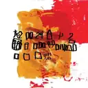
Sean Fermoyle
Failed Album Cover No. 7
I’m a graphic designer who also makes music, so naturally, I have a hard time leaving one creative discipline alone.
Read more
For my latest album, I decided to bring the two together by incorporating some of my six-year-old son’s artwork and alphabet-practice shapes into the visual identity. It seemed like a great idea at the time: part collaboration, part family artifact, part graphic design experiment.
The resulting artwork was perfectly fine—and, honestly, there was something pretty charming about letting a six-year-old’s visual language crash into my own. But as the album itself evolved, so did the concept. The music began heading somewhere else, and the playful, childlike direction no longer felt connected to where the project ultimately landed.
So, in the end, the artwork worked. The concept just didn’t. Such is the glamorous life of making things: sometimes you spend hours developing an idea only to realize the idea has already left the building. My son, of course, remains completely blameless.
Credits Art Director/Designer: Sean Fermoyle, Illustrator: Mylo Fermoyle
Shoe Shiner room3
- SS1
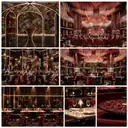
Muxuan Zhao
Eden Noir – A Lost Nightclub Concept
Inspired by the Garden of Eden, Eden Noir reimagines the biblical paradise as a seductive and mysterious nightlife destination, exploring the delicate tension between innocence and temptation, beauty and danger.
Read more
——An Unrealized Vision of a Forbidden Paradise
The design translates the serpent's fluid movements and the garden's organic forms into an immersive architectural language. Sculptural metal installations, intricate floral patterns, reflective surfaces, and deep burgundy tones create a theatrical environment where architecture becomes an integral part of the experience.
Originally conceived as a nightclub, Eden Noir never made it beyond the design stage. What began as an ambitious vision of a forbidden paradise ultimately remained an unbuilt dream—a world that existed only through drawings, renderings, and imagination. Also, Eden Noir was ultimately left unrealized due to the high cost of bringing its ambitious design to life. The complexity of its custom sculptural elements, intricate detailing, and immersive architectural features pushed the project beyond its intended budget.
For SEGD's Design Graveyard, Eden Noir finds a second life as a lost idea worth remembering. Though never realized, the project celebrates the creative potential of concepts left behind, reminding us that even abandoned designs can carry powerful stories, emotions, and possibilities.
Some paradises are never meant to be built, but their stories deserve to be told.
Credits Muxuan Zhao; Zewei Liu; Yuanhao Shen
- SS2
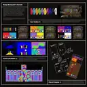
Emily Preece
Currents
Every creative process has its own undercurrent.
Read more
Currents, created for Art on theMART, evolved through countless concepts, experiments, and visual explorations, not all of which made it to the final projection. This collection surfaces the ideas left behind: alternate directions, discarded moments, and unrealized possibilities that helped shape the work we ultimately shared with the world.
- SS3
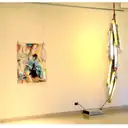
Ann Blaas
Lighting Concept
No description
Video5
- V1
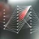
Mary Franck
Neural Nets
A musing on the shift from symbol manipulation to tensor-based computation in the form of a music video mashup of garbled ASCII and GAN diagrams.
- V2
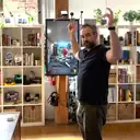
elbē interactive
Kool-Aid Entrance
In 2024, we received an RFP for a traveling exhibit showcasing Kool-Aid and other children's snacks.
Read more
A few years prior, we had created a basic Kool-Aid interactive just for fun at our office. We included a video of this interactive with our RFP submission, but the client ultimately declined.
In the interactive, a stereoscopic camera overlays the Kool-Aid Man's body onto yours, allowing you to crash through a house wall in a style inspired by their 1980s ad campaign.
- V3
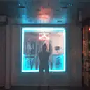
Keegan Barone
Phhhoto series '15/'16
Experimental moving image series exploring identity, solitude, and the body.
- V4
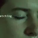
Madeline Poncy
The Watching
An experimental short film about the dystopian nature of governmental surveillance.
- V5
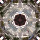
Yuge Zhou
City Garden
No description
Dimensional4
- D1
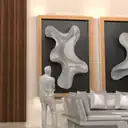
AllKinds Studio
Nashville Project
We were invited to create a custom sculpted triptych for a high-end hospitality client on a very tight timeline.
Read more
The pieces were meant to be gestural movements evoking masculine and feminine energies. The client agreed to an R&D phase to give us the extra time needed to hone in on the design and fabrication method.
To achieve a ceramic-like finish at this large size, we opted to sculpt high density foam by hand, which would then be coated in fiberglass plaster. What you see here are our hand-sculpted maquettes showing the suggested forms at a small scale.
The client requested temporary art while we were wrapping up the maquettes. By the time the maquettes were received they had fallen in love with the temporary art- which ended up being a large scale framed lenticular photography piece, completely different than their original ask. C'est la vie!
- D2
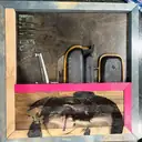
Terry Londy
Lounging
Lounging is part of an ongoing creative scholarship exploration that investigates the evolution of the dimensional poster through material, layering, and fabrication.
Read more
The piece is constructed from reclaimed and overage materials; including white oak, poplar, pine, Baltic birch, and basswood, sourced from a scrap material collection and salvaged shelving. Rather than producing traditional halftones through screen printing, the work translates the visual language of halftone through digital fabrication, layered wood components, and hand-painted surfaces. The forgotten dimensional prototype explores how familiar graphic design processes can be reinterpreted through material and making.
- D3
Kenneth Andreys
Wood Joist Simulator
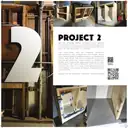
About eight years ago, I built a prototype to test the viability of constructing a vaulted ceiling in between preexisting wood joists. In the end, the prototype did prove the proof of concept and provided the necessary steps to build such a feature.
Credits Kenneth Andreys, Michael Ryan & Oswald Martin (Lafayette Concept Furniture)
- D4
WRATH+LOVE
NO EXIT
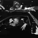
NO EXIT is a photographic essay documenting Chicago’s underground street takeover culture.
Read more
Over two summers, I followed drivers and spectators through the city, capturing a world defined by adrenaline, community, rebellion, and the tension between freedom and consequence.
After completing the series, I approached several local publications about releasing the work. One initially agreed to purchase it, but communication eventually stopped, leaving the project unpublished. Discouraged by the experience, I shelved the photographs and stepped away from art and photography shortly afterward.
Years later, while assembling a portfolio for a meeting with a creative director, I revisited NO EXIT. What began as an effort to showcase my previous work became an opportunity to reconnect with a project I had largely abandoned.
Now, NO EXIT returns as an immersive installation combining documentary photography, a handmade book, salvaged automotive materials, and scent. By bringing physical elements of the environment into the gallery, the installation invites visitors to experience a culture that is often seen but rarely understood.
Digital2
- DG1
Sean Kelly
Unity Live Autostereogram
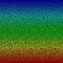
A fan of ASGs (crosseye-3D) since 3rd grade, Sean was reminded of the trick by the 2023 game "STEREOGRAM" and thought they might do better.
Read more
The technique they derived allows color and more complex geometry, but is harder to focus on and lacks a compelling use case.
Portfolio: psychsoftware.org
- DG2
Joey Lawton
No Longer, Still Here
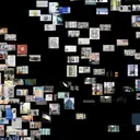
For more than 14 years, Media-Objectives (M-O) brought together designers, artists, and strategists to create work spanning brand strategy, identity, art, exhibitions, experiential graphics, signage, and wayfinding.
Read more
Based in Chicago, with offices in San Francisco and Denver, the studio earned four SEGD Global Design Awards, multiple Interior Design Best of Year Awards, and recognition in Metropolis magazine. When M-O closed its doors in 2023, it left behind an expansive collection of ideas, collaborations, and creative work. This interactive digital archive gives that work a new life, inviting visitors to explore M-O’s legacy through unexpected connections of color, tone, project type, client, and more.
The People Behind M-O:
Adam Farooq · Alexa Wiederrecht Chmura · Allison Rokusek · Amanda Jurmu · Andy McCormack · Brandon McGivern · Chris Fato · Chris Lai · Cody Hartleben · Crystal Adams · Daniel Meeker · Ellen Bean Spurlock · Francie Taylor · Francisco Lopez de Arenosa · Freddy Eshrich · Ian Thomas · Jacob Goble · Joey Lawton · Katarina Gois · Lacey Engelke · Marissa Betley · Noah Jeppson · Rafael Barontini · Ryan Gann · Shane Hendry · Simone Shafer · Stephen Killion · Taylor Chan · Taylor Loutsis · Yonglin Chen · With many thanks to the numerous collaborators, family and friends, incredible clients and our founding sponsor, Valerio Dewalt Train.